# Trait Manager
In GrapesJS, Traits define different parameters and behaviors of a component. The user generally will see traits as the Settings of a component. A common use of traits is to customize element attributes (eg. placeholder for <input>) or you can also bind them to the properties of your components and react on their changes.
WARNING
This guide is referring to GrapesJS v0.15.3 or higher.
To get a better understanding of the content in this guide we recommend reading Components first
# Add Traits to Components
Generally you define traits on the definition of your new custom components (or by extending another one). Let's see in this example how to make inputs more customizable by the editor.
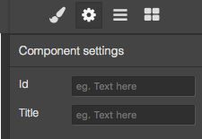
All components, by default, contain two traits: id and title (at the moment of writing). So, if you select an input and open the Settings panel you will see this:
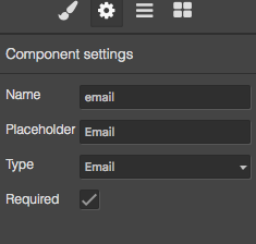
We can start by creating a new custom input component in this way:
editor.DomComponents.addType('input', {
    isComponent: el => el.tagName == 'INPUT',
    model: {
      defaults: {
        traits: [
          // Strings are automatically converted to text types
          'name', // Same as: { type: 'text', name: 'name' }
          'placeholder',
          {
            type: 'select', // Type of the trait
            label: 'Type', // The label you will see in Settings
            name: 'type', // The name of the attribute/property to use on component
            options: [
              { id: 'text', name: 'Text'},
              { id: 'email', name: 'Email'},
              { id: 'password', name: 'Password'},
              { id: 'number', name: 'Number'},
            ]
          }, {
            type: 'checkbox',
            name: 'required',
        }],
        // As by default, traits are binded to attributes, so to define
        // their initial value we can use attributes
        attributes: { type: 'text', required: true },
      },
    },
});
Now the result will be
If you want you can also define traits dynamically via functions, which will be created on component initialization. It might be useful if you need to create traits based on some other component characteristic.
editor.DomComponents.addType('input', {
    isComponent: el => el.tagName == 'INPUT',
    model: {
      defaults: {
        traits(component) {
          const result = [];

          // Example of some logic
          if (component.get('draggable')) {
            result.push('name');
          } else {
            result.push({
              type: 'select',
              // ....
            });
          }

          return result;
        }
      },
    },
});
If you need to react to some change of the trait you can subscribe to their attribute listeners
editor.DomComponents.addType('input', {
  model: {
    defaults: {
      // ...
    },

    init() {
      this.on('change:attributes:type', this.handleTypeChange);
    },

    handleTypeChange() {
      console.log('Input type changed to: ', this.getAttributes().type);
    },
  }
})
As already mentioned, by default, traits modify attributes of the model, but you can also bind them to the properties by using changeProp options.
editor.DomComponents.addType('input', {
  model: {
    defaults: {
      // ...
      traits: [
        {
          name: 'placeholder',
          changeProp: 1,
        }
        // ...
      ],
      // As we switched from attributes to properties the
      // initial value should be set from the property
      placeholder: 'Initial placeholder',
    },

    init() {
      // Also the listener changes from `change:attributes:*` to `change:*`
      this.on('change:placeholder', this.handlePlhChange);
    },
    // ...
  }
})
# Built-in trait types
GrapesJS comes along with few built-in types that you can use to define your traits:
# Text
Simple text input
{
  type: 'text', // If you don't specify the type, the `text` is the default one
  name: 'my-trait', // Required and available for all traits
  label: 'My trait', // The label you will see near the input
  // label: false, // If you set label to `false`, the label column will be removed
  placeholder: 'Insert text', // Placeholder to show inside the input
}
# Number
Input for numbers
{
  type: 'number',
  // ...
  placeholder: '0-100',
  min: 0, // Minimum number value
  max: 100, // Maximum number value
  step: 5, // Number of steps
}
# Checkbox
Simple checkbox input
{
  type: 'checkbox',
  // ...
  valueTrue: 'YES', // Value to assign when is checked, default: `true`
  valueFalse: 'NO', // Value to assign when is unchecked, default: `false`
}
# Select
Select input with options
{
  type: 'select',
  // ...
  options: [ // Array of options
    { id: 'opt1', name: 'Option 1'},
    { id: 'opt2', name: 'Option 2'},
  ]
}
# Color
Color picker
{
  type: 'color',
  // ...
}
# Button
Button with a command to assign
{
  type: 'button',
  // ...
  text: 'Click me',
  full: true, // Full width button
  command: editor => alert('Hello'),
  // or you can just specify the Command ID
  command: 'some-command',

}
# Updating traits at run-time
If you need to change some trait on your component you can update it wherever you want by using Component API
The trait is a simple property of the component so to get the complete list of current traits you can use this:
const component = editor.getSelected(); // Component selected in canvas
const traits = component.get('traits');
traits.forEach(trait => console.log(trait.props()))
In case you need a single one:
const component = editor.getSelected();
console.log(component.getTrait('type').props()); // Finds by the `name` of the trait
If you want, for example, updating some property of the trait, do this:
// Let's update `options` of our `type` trait, defined in Input component
const component = editor.getSelected();
component.getTrait('type').set('options', [
  { id: 'opt1', name: 'New option 1'},
  { id: 'opt2', name: 'New option 2'},
]);
// or with multiple values
component.getTrait('type').set({
  label: 'My type',
  options: [...],
});
You can also easily add new traits or remove some other by using addTrait/removeTrait
// Add new trait
const component = editor.getSelected();
component.addTrait({
  name: 'type',
  ...
}, { at: 0 });
// The `at` option indicates the index where to place the new trait,
// without it, the trait will be appended at the end of the list

// Remove trait
component.removeTrait('type');
# Define new Trait type
Generally, for most of the cases, default types are enough, but sometimes you might need something more. In that case, you can define a totally new type of trait and bind any kind of element to it.
# Create element
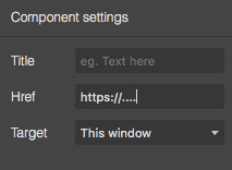
Let's update the default link Component with a new kind of trait. This is the default situation of traits for a simple link.
Let's just replace all of its traits with a new one, href-next, which will allow the user to select the type of href (eg. 'url', 'email', etc.)
// Update component
editor.DomComponents.addType('link', {
  model: {
    defaults: {
      traits: [
        {
          type: 'href-next',
          name: 'href',
          label: 'New href',
        },
      ]
    }
  }
});
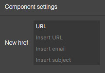
Now you'll see a simple text input because we have not yet defined our new trait type, so let's do it:
editor.TraitManager.addType('href-next', {
  // Expects as return a simple HTML string or an HTML element
  createInput({ trait }) {
    // Here we can decide to use properties from the trait
    const traitOpts = trait.get('options') || [];
    const options = traitOpts.length ? traitOpts : [
      { id: 'url', name: 'URL' },
      { id: 'email', name: 'Email' },
    ];

    // Create a new element container and add some content
    const el = document.createElement('div');
    el.innerHTML = `
      <select class="href-next__type">
        ${options.map(opt => `<option value="${opt.id}">${opt.name}</option>`).join('')}
      </select>
      <div class="href-next__url-inputs">
        <input class="href-next__url" placeholder="Insert URL"/>
      </div>
      <div class="href-next__email-inputs">
        <input class="href-next__email" placeholder="Insert email"/>
        <input class="href-next__email-subject" placeholder="Insert subject"/>
      </div>
    `;

    // Let's make our content interactive
    const inputsUrl = el.querySelector('.href-next__url-inputs');
    const inputsEmail = el.querySelector('.href-next__email-inputs');
    const inputType = el.querySelector('.href-next__type');
    inputType.addEventListener('change', ev => {
      switch (ev.target.value) {
        case 'url':
          inputsUrl.style.display = '';
          inputsEmail.style.display = 'none';
          break;
        case 'email':
          inputsUrl.style.display = 'none';
          inputsEmail.style.display = '';
          break;
      }
    });

    return el;
  },
});
From the example above we simply created our custom inputs (by giving also the possibility to use option trait property) and defined some input switch behavior on the type change. Now the result would be something like this
# Update layout
Before going forward and making our trait work let's talk about the layout structure of a trait. You might have noticed that the trait is composed by the label and input columns, for this reason, GrapesJS allows you to customize both of them.
For the label customization you might use createLabel
editor.TraitManager.addType('href-next', {
  // Expects as return a simple HTML string or an HTML element
  createLabel({ label }) {
    return `<div>
      <div>Before</div>
      ${label}
      <div>After</div>
    </div>`;
  },
  // ...
});
You've probably seen already that in trait definition you can setup label: false to completely remove the label column, but in case you need to force this behavior in all instances of this trait type you can use noLabel property
editor.TraitManager.addType('href-next', {
  noLabel: true,
  // ...
});
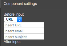
You might also notice that by default GrapesJS applies kind of a wrapper around your inputs, generally is ok for simple inputs but probably is not what you need where you're creating a complex custom trait. To remove the default wrapper you can use the templateInput option
editor.TraitManager.addType('href-next', {
  // Completely remove the wrapper
  templateInput: '',
  // Use a new one, by specifying with `data-input` attribute where to place the input container
  templateInput: `<div class="custom-input-wrapper">
    Before input
    <div data-input></div>
    After input
  </div>`,
  // It might also be a function, expects an HTML string as the result
  templateInput({ trait }) {
    return '<div ...';
  },
});
In this case, the result will be quite raw and unstyled but the point of custom trait types is to allow you to reuse your own styled inputs, probably already designed and defined (or implemented in some UI framework). For now, let's keep the default input wrapper and continue with the integration of our custom trait.
# Bind to component
At the current state, our element created in createInput is not binded to the component so nothing happens when you update inputs, so let's do it now
editor.TraitManager.addType('href-next', {
  // ...

  // Update the component based on element changes
  // `elInput` is the result HTMLElement you get from `createInput`
  onEvent({ elInput, component, event }) {
    const inputType = elInput.querySelector('.href-next__type');
    let href = '';

    switch (inputType.value) {
      case 'url':
        const valUrl = elInput.querySelector('.href-next__url').value;
        href = valUrl;
        break;
      case 'email':
        const valEmail = elInput.querySelector('.href-next__email').value;
        const valSubj = elInput.querySelector('.href-next__email-subject').value;
        href = `mailto:${valEmail}${valSubj ? `?subject=${valSubj}` : ''}`;
        break;
    }

    component.addAttributes({ href })
  },
});
Now, most of the stuff should already work (you can update the trait and check the HTML in code preview). You might wonder how the editor captures the input change and how is possible to control it.
By default, the base trait wrapper applies a listener on change event and calls onEvent on any captured event (to be captured the event should be able to bubble (opens new window)). If you want, for example, to update the component on input event you can change the eventCapture property
editor.TraitManager.addType('href-next', {
  eventCapture: ['input'], // you can use multiple events in the array
  // ...
});
The last thing, you might have noticed the wrong initial render of our trait, where inputs are not populated in case of already defined href attribute. This step should be done in onUpdate method
editor.TraitManager.addType('href-next', {
  // ...

  // Update elements on the component change
  onUpdate({ elInput, component }) {
    const href = component.getAttributes().href || '';
    const inputType = elInput.querySelector('.href-next__type');
    let type = 'url';

    if (href.indexOf('mailto:') === 0) {
      const inputEmail = elInput.querySelector('.href-next__email');
      const inputSubject = elInput.querySelector('.href-next__email-subject');
      const mailTo = href.replace('mailto:', '').split('?');
      const email = mailTo[0];
      const params = (mailTo[1] || '').split('&').reduce((acc, item) => {
        const items = item.split('=');
        acc[items[0]] = items[1];
        return acc;
      }, {});
      type = 'email';

      inputEmail.value = email || '';
      inputSubject.value = params.subject || '';
    } else {
      elInput.querySelector('.href-next__url').value = href;
    }

    inputType.value = type;
    inputType.dispatchEvent(new CustomEvent('change'));
  },
});
Now the trait will update even on component change like:
editor.getSelected().addAttributes({ href: 'mailto:new-email@test.com?subject=NewSubject' })
To recap what we have done so far, to create a custom trait type all you will need are 3 methods:
createInput- Where we define our custom HTML elementonEvent- How to update the component on inputs changesonUpdate- How to update inputs on component changes
# Result
The final result of what we have done can be seen here
# Integrate external UI components
By looking at the example above might seems like a lot of code, but at the end, it's just about a little bit of logic and the native DOM API which is not super pretty. If you use a modern UI client framework (eg. Vue, React, etc.) you could see that the integration is even easier. There is how it would be integrating a custom Vue Slider Component (opens new window) as a trait
editor.TraitManager.addType('slider', {
  createInput({ trait }) {
    const vueInst = new Vue({ render: h => h(VueSlider) }).$mount();
    const sliderInst = vueInst.$children[0];
    sliderInst.$on('change', ev => this.onChange(ev)); // Use onChange to trigger onEvent
    this.sliderInst = sliderInst;
    return vueInst.$el;
  },

  onEvent({ component }) {
    const value = this.sliderInst.getValue() || 0;
    component.addAttributes({ value });
  },

  onUpdate({ component }) {
    const value = component.getAttributes().value || 0;
    this.sliderInst.setValue(value);
  },
});
The integration with external components is possible by following these simple core points:
- Component rendering:
new Vue({ render: ...
Depends on the framework, for example, in React it should beReactDOM.render(element, ... - Change propagation:
sliderInst.$on('change', ev => this.onChange(ev))
The framework should have a mechanism to subscribe to changes and the component should expose that change (opens new window)
We've also usedonChangemethod which comes handy when you need to trigger manually theonEventevent (you should never call directlyonEventmethod, but only viaonChangewhen you need) - Property getters/setters:
sliderInst.getValue()(opens new window)/sliderInst.setValue(value)(opens new window)
The component should allow to read and write data from the instance